

It's not really taking a picture of light - it's taking a picture of feeling. Perhaps the best way of evoking feeling and telling stories in pictures is through the use of color theory in photography. Whether you're taking pictures of people, landscape photography, or city settings, an awareness of how colors relate to each other can transform ordinary photos into masterpieces. From warm golden sunset colors to cool blue city skies, color creates mood, adds depth, and guides your viewer's eye exactly where you want them to.
Let’s learn the fundamentals of color theory photography, how to utilize a complementary colors guide, design emotional color palettes, become proficient at creative use of contrast, apply down-to-earth color harmony tricks, and even sharpen your photos after the shoot with editing color balance techniques.
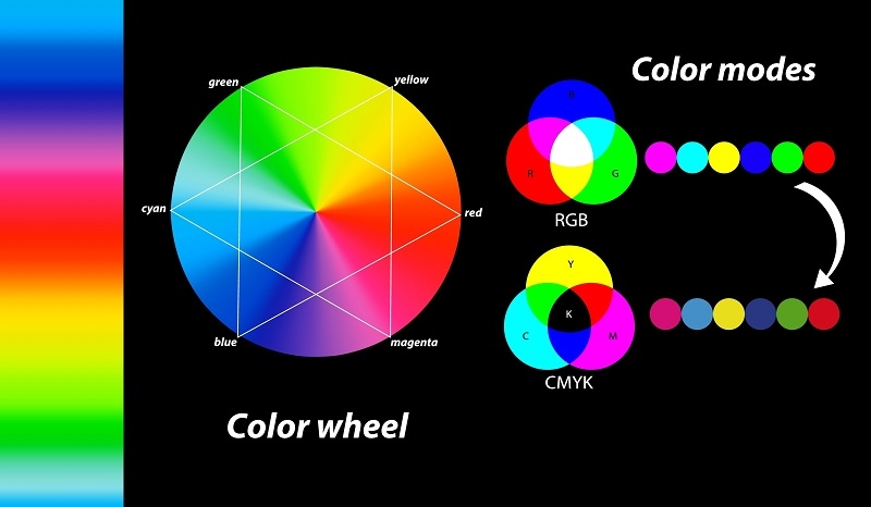
Color theory in photography is a science and an art of color interacting with each other and the effect colors have on perception. It borrows heavily from traditional visual arts, where the color wheel is utilized as a point of reference in contrast and harmonizing colors successfully.
Color theory in photography is fundamentally founded on three important aspects:
Every photo you take carries an emotional undertone depending on its color scheme. For example:
By understanding color theory for photography, you can predict how people are actually going to emotionally respond to your pictures and make money from that.
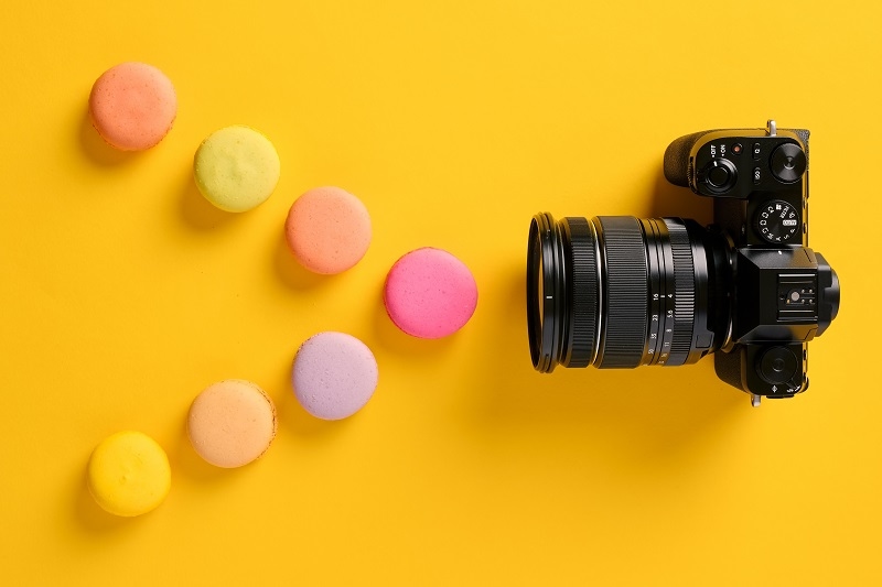
If you desire your photographs to be attention-grabbing, the rule of complementary colors is one to learn. The complementary colors are across from each other on the color wheel - red and green, blue and orange, yellow and purple. Side by side, they create a dramatic contrast that commands the eye of the viewer immediately.
In photography, it has the power to elevate even the simplest compositions to levels they never dreamed they could ever attain. Just consider:
These color combinations come alive in pictures as complementary colors have a tendency to draw each other forward. Complementary colors, according to the guide to complementary colors, provide visual balance but with tension - an excellent balance for dramatic photographs.
When you’re composing your shot, try looking for color pairings in nature or urban scenes. Many professionals even use color wheels or mobile apps to plan scenes based on the complementary colors guide before heading out to shoot.
Each photo that you take has a mood. What gives that mood added gravity is by generating emotional color palettes that are in line with your creative goal. An emotional color palette is simply a combination of colors, which subsequently generates some psychological reaction.
Let us see a few instances of emotional color palettes in action:
Intentionally designing your emotional color schemes gains mastery over how others experience your photos. You're no longer allowing emotion to occur randomly - you're making it happen on purpose.
A good practice is to take the same subject on various emotional color palettes. See how your version of the photo changes on each attempt. With this exercise, your understanding on how photography color theory influences mood and story becomes more practical.
Though harmony between colors is possible, contrast provides energy and form to your image. Applying contrast in a creative manner is one of the most worthwhile techniques to accentuate subjects, provide depth, and lead the viewer's eye around the photograph.
There are a number of methods of applying contrast creatively in photography:
Photographers are banking on contrast being used creatively to narrate the image. It's not about making an image "pop" - it's about making it matter. If you want smooth balance or showy drama, contrast does the heavy lifting of converting that creative decision into visual language.
Having conquered contrast, harmony is next - getting colors to play nicely together. Tips on color harmony assist photographers in keeping things cohesive and flowing visually, avoiding chaos within the image.
Below are five tips on color harmony that every photographer must learn:
Applying all of these color harmony principles doesn't mean that every picture should be soft and unsharp - it's simply a matter of creating visual rhythm. Whether you want graphic contrast or silent harmony, harmony makes your image stick together.
Despite your best planning and lighting, your photos may need retouching in post-processing. Color balance editing comes in where that's concerned. It adjusts the color temperature, adds mood, and makes your artistic vision a reality.
Here's how to edit color balance well:
When done well, color balancing editing ties all of your photo composition, lighting, and tone together to appear smooth and integrated.
Now, let's discuss how color theory photography is used in real life:
Use warm colors like pale oranges and cream to establish intimacy. Utilize a color guide of complements (e.g., teal backgrounds and orange skin tones) to have your subject pop out by itself. Avoid the use of clashing backgrounds by using the tips of color harmony.
Nature provides unlimited possibilities for mood color schemes - from frozen blues of lakes to warm golds of autumn. Play with contrast by placing light skies against dark shadows for ultimate drama.
The urban area provides unlimited possibilities for dramatic contrasts. Look for graffiti walls, neon lights, or bold reflections. Make use of the guide to complementary colors to capture spontaneous but harmonious color pairings.
Color psychology influences customers. In product photography, design emotive color schemes that capture the brand message. Employ blues for trust and reds for energy, for instance.
You can experiment with color theory in photos without landing in these pitfalls:
Missing post-processing: Even your best shot is improved by careful editing and color balance to further refine tone and mood.
Remember that balance, not brightness, creates a great color photograph.
Mastery of color theory in photography changes the way you shoot every photo. It is not so much a matter of using colors - it is sensing them, being able to move them around, and having them communicate through your photos.
From studying the rule of complementary colors guide and experimenting with evocative color combinations to experimenting with contrast, applying color harmony principles, and manually adjusting color balance, each step brings you closer to taking just great photos. An excellent photographer doesn't take a picture - he paints a pictorial concerto. Next time you lift your camera, imagine yourself as a painter: employ color as voice, feeling, and art.
This content was created by AI